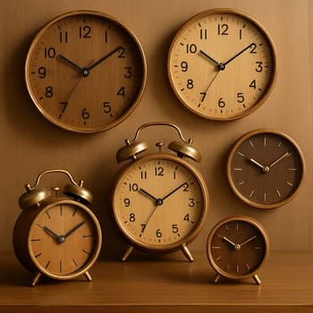
Warm wood
Soft edges, quiet grain

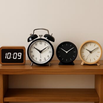
Clock collection
This collection is arranged like a quiet walk through a clock shop: start with room, then choose a material, then decide how you want time to sound when it moves.
Viewing: all clocks in the collection.
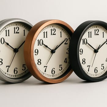
Materials & textures
Some clocks feel like furniture, others more like instruments. These three lanes help you notice how texture changes the mood of a room.
Room bundles
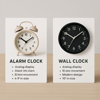
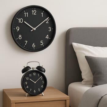
Each bundle pairs a wall clock with an alarm so that colours, shapes and sound levels feel related.
Ultra-silent sweep wall clock plus a sunrise alarm with a soft first minute.

Clear, minimal wall dial and a small alarm that doubles as a session timer.

High-contrast wall clock plus a compact alarm that keeps an eye on cooking minutes.
Wall-only picks
These wall-only picks are for the spaces where a single clear dial is enough: no extra alarms, no extra screens, just hands and markers.
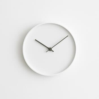
Slim bezel, soft contrast and a silent sweep second hand for calm corridors and studios.

Oversized numerals for living rooms where the clock becomes part of the furniture.

A group of compact clocks for playful corners and creative studios.
Alarm shelf
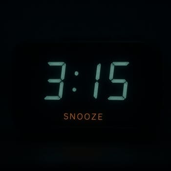
Some alarms fade in with light, others start with a clear tone. This shelf shows how a few different models can cover every kind of wake-up.
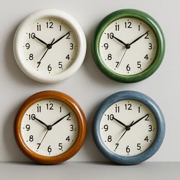
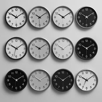
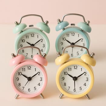
Colour lines
Choose a line that matches your furniture and lighting: monochrome, warm or soft pastel.
Black, white and charcoal clocks that sit easily with minimal interiors.
Terracotta, brass and oak frames that echo warm textiles and wood.
Powder blue, mint and soft sand tones for gentle, airy rooms.
Silence path
Each clock in the collection sits somewhere on a simple silence path. It helps you match sound level to the way a room is used.
Desk clusters
On a desk, a clock can act as a focus anchor, a gentle timer or a small reminder to pause.

Clean dial, no extra scales, just a clear sense of how long a deep-work block lasts.

A more playful clock that makes it easy to time sketch sprints and breaks.

Two compact clocks so each person can set their own rhythm without extra screens.
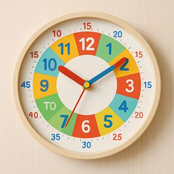
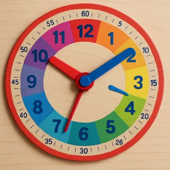
Kids & learning
In children’s rooms, clocks are both tools and toys. The collection includes pieces that make learning time feel simple and friendly.
Segmented dials help children see hours and quarters at a glance.
Friendly, rounded numerals are easier for early readers to recognise.
Impact-resistant frames are better for play spaces and shared bedrooms.
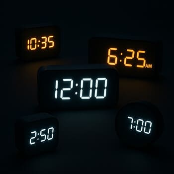
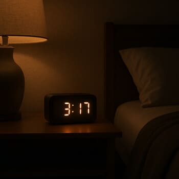
Evening & low light
Some clocks are made for daylight, others for the slow light of late evenings. This line highlights pieces that stay clear when lamps and windows are dim.
Digital clocks with diffused light that marks the time without filling the room.
Reflective hands and markers that pick up just enough light from a nearby lamp.
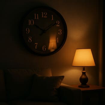
Larger dials that stay readable from the sofa even when only a few lamps are on.

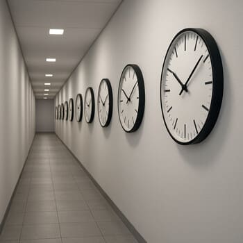
Entry & hallway
Entryway and hallway clocks are seen in passing. They need to be clear at a distance, but not so loud that they dominate the space.
Shelves & styling
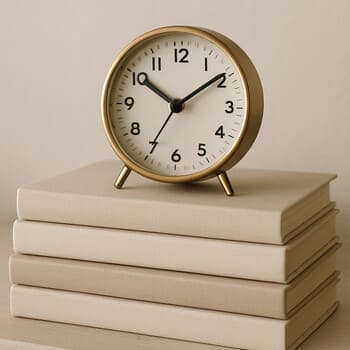
Clocks become part of the shelf when they sit next to books, plants and small objects. These recipes are based on how many pieces you like to keep out.
A compact clock on a short stack of books, for narrow shelves near beds and sofas.
A simple clock next to a plant pot to soften the look of a working shelf.

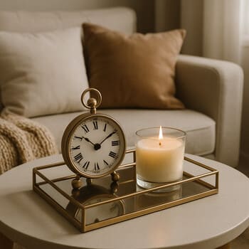
A small tray bringing together a clock, a candle and one personal object.
Time zones
When friends, family or work live in other time zones, a small cluster of clocks can keep those hours visible without opening a screen.
Limited runs
Most of the collection is steady and repeatable. Some pieces, however, are made in shorter runs with special colours or textures.
A darker dial and brass rim that pair best with deep painted walls and evening rooms.

A compact alarm in a seasonal colour, kept in short runs so the shade stays special.
Collection notes
Each clock in the collection comes with a few small symbols for sound, room and light. Reading them once makes browsing much faster next time.
A wave with one, two or three lines marks soft tick, low hum or full silent sweep.
Small silhouettes show where the clock feels most at home: bed, desk, sofa or hallway.
A circle with a glow band around it marks dials that are easier to read at night.
You will see these small marks on every product card. They are there so you can compare clocks quickly without reading long paragraphs each time.
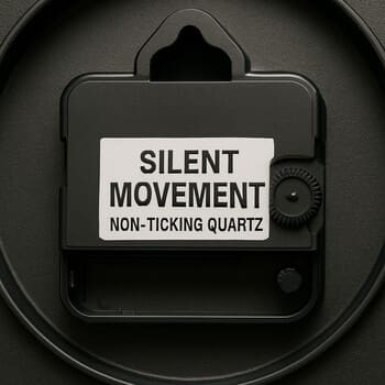
Longevity
Behind each dial is a simple idea: fewer moving parts, clear access to batteries and cases that are easy to remove from the wall when needed.
Quick compare
The collection is not about giant tables. Instead, you can bring a few clocks into a small compare strip and look only at what changes.
See only the sound icons for your chosen clocks in one short row.
Check which clocks overlap on bedrooms, desks or living rooms.
View how each dial behaves in evening light without reading long descriptions.
It is designed for slow decisions: fewer options on screen, more clarity for each one.
Next steps
You have seen the main lines of the Tick & Rise collection: rooms, materials, colours and the way sound behaves in different spaces. The next pages help you choose a specific clock.
Return to the home page to see how a few key clocks change the feeling of a wall in context.
Visit the alarm guide to read about wake-up styles, tones, travel habits and bedside layouts.
The collection can stay small on purpose. Over time clocks may move between pages, but the idea remains the same: fewer pieces, clearer choices and time that sounds the way you want.